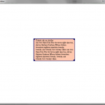
Today, I’ve created a popup dialog that will be used to display information to the player. It’s nothing to look at, but I feel like it’s important to get right, since the player will be spend a lot of their non-active gameplay time reading them, and it the popups don’t look right, then the game won’t feel as well put together as it otherwise might. I figure I’ll add an option to slowly scale it smaller and smaller, and also fadeout, just so I can broaden its use throughout my code. Once I get the scaling set, I can also start to implement damage numbers, because I once swore to myself that my game would have numbers everywhere.
In fact, this is a good time to mention that my game will have a stupid amount of stat tracking. Like everything possible will be tracked, and hopefully exported to xml or something so you can browse it yourself. I’m talking like amount of times you pressed a given key, or hit or missed something, or the average amount of experience you’ve earned in the first 5 minutes of the game. Little things like that, things that no one really thinks about, but I’m sure there’ll be one fan that is all about stats, and he’ll love it. I don’t know if it’ll drain the memory though, Python’s pretty slow already.
Hit the jump for an explanation of how I wrote my word wrapping , autosizing popup box.
The way I made it is fairly long for something as simple as it is, but essentially what I’m doing is going word by word and testing its length against the desired width of the popup. Then, once the list of words is as big as it can get, I chop it off the big list of words and toss it into a new list of all the separated lines. Then I go through each set of lines in that list, and render them to their surface, as Pygame forces you to do, and then put them all into a new list again. Using the newest list, I blit them all, in order onto a new surface, exactly the same width as the initial one, and the height of all the lines stacked on top of each other.
Now I create a bigger surface, which is the width of a line, plus the full width of the desired borderwidth and the height of all the rendered text’s surfaces piled on top of each other, plus that borderwidth again. I then draw a circle on each of the four corners, centered of the exact corner ( (0,0) or (w-1,h-1) ) and also draw a line from each of the four corners.
Once the biggest surface has been created and bordered, I blit the surface with text rendered onto it, giving room for the borders on all side. This results in the image above, with a few tweaks to color and such sprinkled in for good measure.

I commend your efforts. Writing your own UI can be very tedious. As we speak I am busy implementing scrollbars for Voxel Heroes and my brain is leaking out my ears.